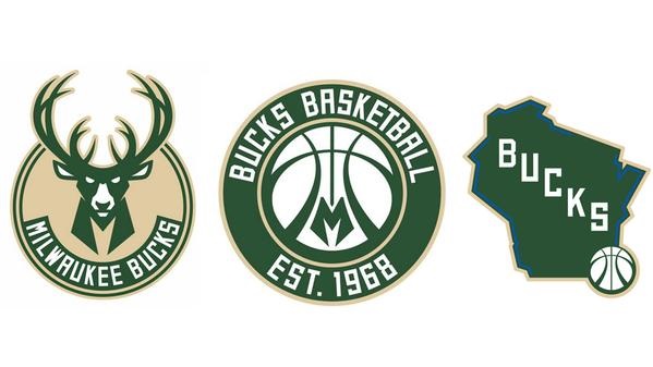
The Milwaukee Bucks are in a new era of ownership, coaching, and personnel, and they have decided to complete the remake of the team by unveiling new logos.
The new logo looks pretty similar to the old one, but there are a few differences.
Here is what they say of the new emblem: “The new Buck is only looking ahead, an imposing figure determined and focused on the path in front of him.”
Some of the differences for this logo are that the buck’s antlers has more points, and there is a basketball above the deer’s face and an “M” below it.
The second logo is supposed to be a badge of honor that serves as “a strong reminder of the rich heritage of Bucks basketball in Milwaukee,” because the team was founded in 1968.
I don’t think much of the logos except that they look like much more suited to go on the left breast of a collared shirt rather than on a T-shirt or hat for fans. And I hope they don’t use that third logo for much; it looks like the sort of thing I would have designed in third grade.


