 If only Mr. Blackwell were still alive… He probably would have had a heart attack and died, especially after seeing sports’ current version of the fashion statement. Uniforms. Watching last week’s Oregon-Auburn game, one might have gotten the impression that a box of Crayolas had exploded. Burnt orange and navy blue. Silver and some shade of green you’d be hard-pressed to find at a consignment shop. The amazing thing about Oregon’s duds (with the emphasis on DUD) is that the team wore a different jersey combination for each of their thirteen games this season and, like the sequels to Godfather, each was worse than the one before it. Team gear has become big business these days, as evidenced by the Ducks’ tribute to Diana Ross, with the size of the wardrobe selection they’ve been sporting. Perhaps the school took a page out of George Costanza’s book of dressing based on mood.
The funny thing about uniforms is that “uni” actually means one, according to my Latin language training. (I read Wikipedia). Maybe the word needs updating. Oregon rolled out a baker’s dozen, and seemingly every professional team has not only a home and away jersey, but also a third jersey designed to pry the money out of fervent fans who want to look like the human balance beam, Timofey Mozgov (namely a guy wearing a basketball jersey). There is also a relatively new phenomenon known as the throw-back which, in some cases, is code for throw-away. Anyone who has seen the Denver Broncos wearing their inaugural AFL uniforms can attest that these beauties were probably more enjoyable, say, in the era of black-and-white television screens.


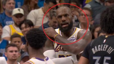
It would seem counter-intuitive wearing a uniform with someone else’s name on it. “Excuse me, Mr. Bryant…? Oh, sorry, I thought you were Kobe, you guys have the same uniform.” (The 8-inch height difference and lack of discernible athletic talent probably should have been an indicator.) For some reason, though, the urge to wear LeBron’s dress shirts or Kevin Durant’s slacks is not as pressing. I still shiver at the thought of accidentally wearing someone else’s gym shorts during PE. And, while purple and gold or green will be donned and applauded by fans from LA to Boston as long as it is in jersey form, no one would ever think of sporting leisure suits in these colors. Such is the mystique of the uniform.


Jersey designs have come a long way since the orange creamsicle/puke-stained Buccaneers uniforms of the John McKay era. Or, how about the Houston Astros uniforms of the 1970s, which can best be described as the color shades of sunset reflecting off layers of barbecue sauce. If you remember anything about the Dave Winfield and Tony Gwynn Padres teams, you no doubt will remember the mustard came off the hot dog and landed on those doozeys. No surprise they were high on the LBS list of ugliest throwback jerseys ever. The Toronto Raptors original uniform featured an image of a jilted Barney-looking creature. That may have not been very daunting for the opposition given their record but, perhaps, the Vancouver Grizzles get-up (yes, boys and girls, Canada, actually had 2 “basketball” teams once) which had a tempestuous looking grizzly leaping out from Bryant “Big Country” Reeves’ chest did. Of course, you’d probably be angry, too, if you had to be featured on that pastel-colored nightmare. Possibly you may remember the Denver Nuggets jerseys of the 1980s which featured Tetris pieces in front on a color scheme that must have been influenced by a Beatles’ White album song. Master showman Bill Veeck once experimented with a uniform with the Chicago White Sox that featured cut-offs (to say nothing of Bill Belichick’s eviscerated sweater). Wonder why that never caught on…
 Like the ugly color schemes of yore, some trends have been tried, and some have failed spectacularly. Michael Jordan tried the Gene Kelly look with his patent leather shoes after his baseball sabbatical. Alonzo Mourning’s Jeff Van Gundy-sized leg warmer in the 1998 playoffs went bust. Some may remember those turn-ahead-the-clock night disasters that MLB teams wore in 1999 that were one part abstract and one part drunken bet (Orwell probably didn’t see those coming). While some uniforms of the past have come back into vogue, fortunately for current-day sports fans the ketchup, mustard, and molasses hues of the past have gone the way of Al Hrabosky’s Fu Manchu. Though, some remainders of the past hang around, manifested in the middle-aged fan squeezing into a two-sizes too small Jeff Hornacek jersey, the color of which did not age as gracefully as he did.
At this moment, the marketing deparments of various professional teams are hard at work looking to craft the new look that will either end up in the window of a store front or as a tool to clean said window. Athlete worship will continue to be manifested in colorful fabric displays. Just be on the lookout. That guy wearing a jersey who emerges from the local watering hole drenched in booze, looking disoriented, and smiling at everybody might actually be Ron Artest.

