I don’t typically post about team uniforms, but these are so ugly they warrant our attention. After watching Oregon State win a couple of CWS titles in a row, Oregon decided it was about time to start fielding a baseball team again. And if their new uniforms are any indication of team performance, they won’t be winning many games this season. As passed along by site contributor Andy.

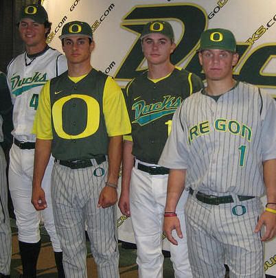
OK, let’s just start with that “O” on the pants. That’s totally overdoing it. Doesn’t need to be there, so why have it there? Another thing, when did it become mandatory for jersey tops to be two pieces? Must sleeves be necessary? And do I even need to bother with that hideous green uniform that has the gigantic “O” in the middle? What are they doing, going for the thunder-labia appeal? Let’s just hope those are the alternates and that the team never wears em. Jeez, if that’s the future of baseball uniforms, I’m not so sure I want to be a fan. Of course, a post on ugly unis would not be complete without pics of some of the ugliest unis in sports. My boy Dayn Perry has the Top 10 ugliest uniforms in college football. Here’s a sample:

Related posts
- OK, So the Team in Green’s the Boston Celtics, Right?
- Denver Broncos Sport Ugly Yellow Jerseys Against Patriots
More Hot Stories at larrybrownsports.com
This entry was posted on Thursday, November 6th, 2008 and is filed under Sports Business. You can follow any responses to this entry through the RSS 2.0 feed. You can skip to the end and leave a response. Pinging is currently not allowed.


80s Padres >>>>>>>>>>>>>>>>>>>>>>>> those Unis
Since when did new and unique become a “new standard hideous uniforms”? Nike defiantly hires some qualified designers for their sports apparel and all Nike’s custom creations for Oregon have been attacked. However what I think critics are so angry about is that Oregon does not conform to the ‘traditional’ Football uniform or ‘traditional’ baseball uniform instead they offer a new perspective on sports fashion. If you had Nike corp. at your disposal would you ask them to stitch you up an average, contemporary jersey? No you’d take a new approach and do something different. In my opinion the new Oregon baseball uniforms are classy, my favorite being both uniform styles using the word “Ducks” across the front. So all you sports fashion critics can stop being so immature and stop insulting Oregon’s visionary uniforms.
This is baseball dude, not a fashion show.